SwiftInk

SwiftInk
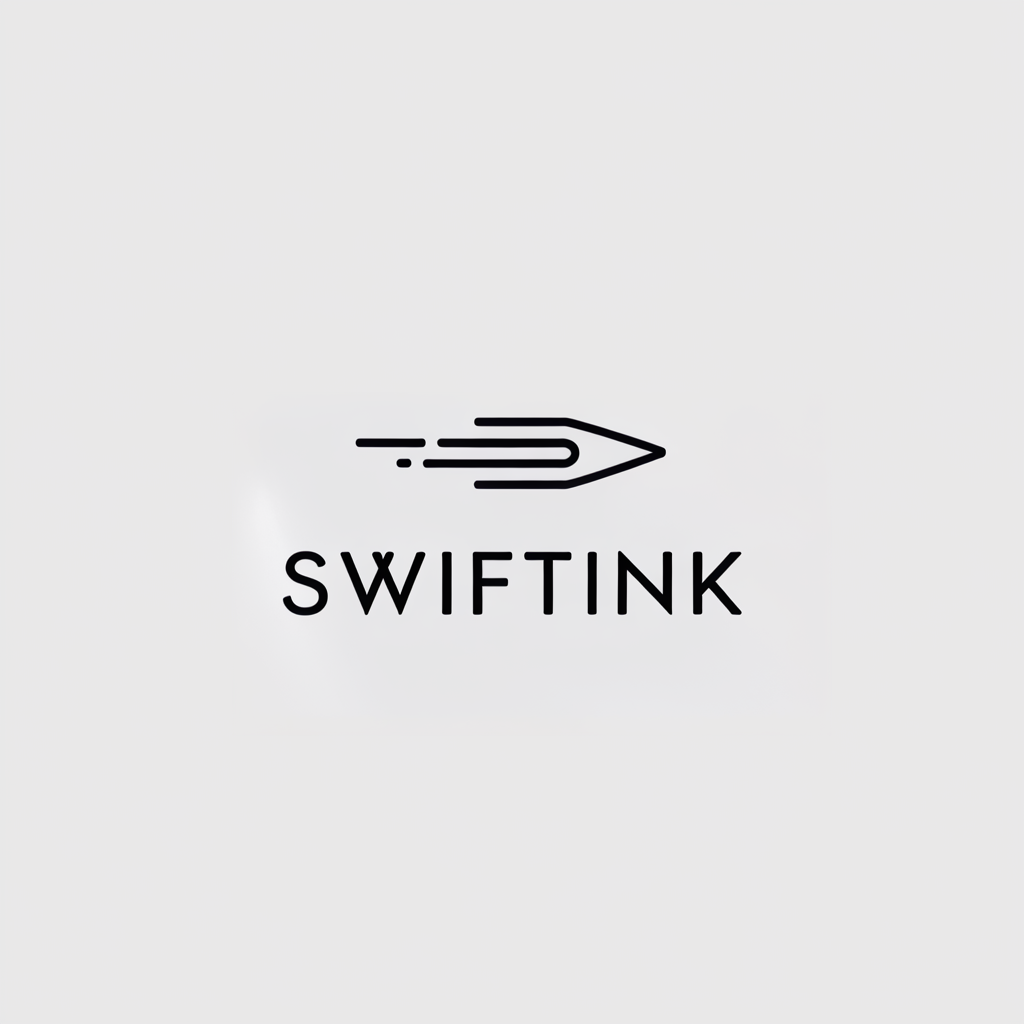
The “Swiftink” logo is a sleek, modern design that combines imagery and typography to convey speed, efficiency, and precision. Here’s an analysis and interpretation of the elements:
- Symbol (Stylized Pen/Arrow):
- The main graphic element resembles a pen tip or an arrow in motion, created with streamlined, parallel lines. This symbol effectively captures the idea of “swift” or fast motion, as well as precision and direction.
- The design evokes the concept of writing or communication (represented by the pen) and speed (suggested by the dynamic lines), making it ideal for a brand involved in writing, design, printing, or any swift service.
- Typeface:
- The font is clean, sans-serif, and slightly extended, which gives it a professional and modern appearance. The letter spacing enhances readability and adds a sense of openness and clarity.
- The black color of the text and icon is classic, suggesting professionalism, reliability, and sophistication.
- Overall Impression:
- The simplicity of the logo is impactful, conveying a brand that is efficient and focused. The minimalistic design and monochrome color scheme make it versatile for various applications and adaptable to different backgrounds.
- The combination of the fast-moving pen graphic and the brand name “Swiftink” suggests a company that offers quick, accurate, and reliable services, likely in the fields of communication, content creation, or digital solutions.
Creative Definition: The Swiftink logo reflects a commitment to rapid and high-quality service in writing, communication, or creative industries. The swift-moving pen symbol not only conveys speed but also precision, while the clean typography emphasizes clarity and professionalism. Swiftink stands out as a brand that values efficiency and accuracy, delivering results in record time.

