buykia

buykia
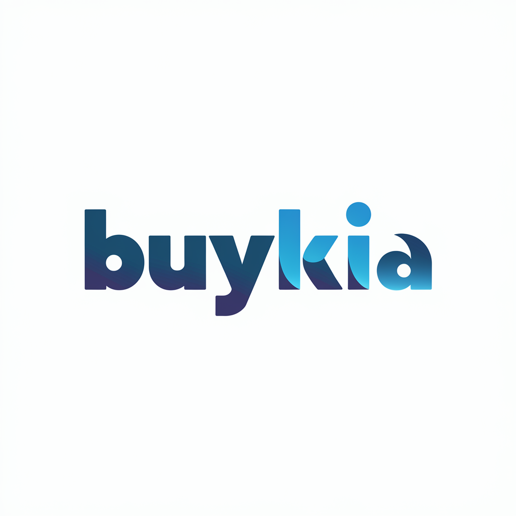
The “buykia” logo is a modern and sleek wordmark that uses color gradients and rounded typography to create a welcoming and stylish brand identity. Here’s a closer analysis:
1. Typography:
The font style is soft and rounded, which adds a friendly and approachable feel to the brand. It communicates a sense of ease and accessibility, making it suitable for an e-commerce or service-oriented business.
The lowercase letters give the logo a relaxed, casual tone, which could appeal to a broad audience looking for a simple, straightforward buying experience.
2. Color Gradient:
The gradient from dark blue to a bright cyan creates a sense of motion and energy. It’s visually appealing and gives the logo a modern, digital touch, often associated with tech-forward or online-focused brands.
The transition in color also adds a dynamic feel to the logo, suggesting progress or innovation, which could be fitting for a business focused on evolving customer needs or a seamless shopping experience.
3. Design Elements:
The seamless blend of letters, particularly with the unique treatment of the “k,” adds a bit of creative flair to the otherwise minimalist design. This creates a visual focal point and gives the brand an identifiable, memorable character.
The clean white background keeps the design simple and ensures that the color gradient in the text stands out effectively.
4. Overall Impression:
The logo is clean, modern, and professional, with a tech-savvy aesthetic that would resonate well in digital marketplaces or online platforms.
The color choice and gradient hint at reliability and innovation, while the soft typography keeps the brand approachable and user-friendly.
Creative Definition: The buykia logo effectively combines modernity with approachability, positioning the brand as a progressive, easy-to-access platform. The gradient and soft letterforms communicate trust and innovation, suggesting that “buykia” is a forward-thinking company focused on providing a seamless shopping experience.
